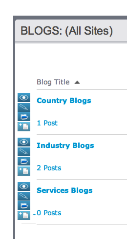
Currently when a blog contributor opens the blog gadget they see a list of one or more Blogs. There is no obvious way to get to the blog list in order to add a post from this view.
Clicking on the blog title itself does not open the blog list but rather, opens the actual blog template preview page when it should probably open up the blog list. Mysteriously, clicking on the post counter seen here:

DOES take the contributor to the place where they can add a blog post (by clicking in the upper right corner on the icon that looks pretty much just like the icon on the blog list view:
![]()
vs.
![]()
On the blog list view they might notice a little down triangle that, when clicked, shows this:

This seems like an ideal place to include a “new post” option since this triangle is associated with a specific blog already which would obviate the need for the contributor to click on the post counter link under the blog title (or know to click the drop-down option of “view posts”.
Similar to other places in the CM1 interface where exposed icons rather than click-throughs might be warranted, this is a place where icons aligned along side the Blogs would help the workflow. Maybe something like: