I want to present a list of office location pages from which a user can make a selection. But the list needs to be a dropdown. Navigation widget doesn’t work because it is relative to the current page whereas what I want is the same list on every page.
Dan,
I’m sure there is a way to leverage our DTS API to create your own auto-list type of query, and then integrate the output with a jQuery select box, but I’ve never done anything like that.
Not knowing your exact implementation, I’m not sure if this would work as an alternative, but a much simpler solution would be to give the auto-list widget a root class (in the Style tab), and then style the descendant UL and LI elements into a CSS dropdown menu, similar to what’s covered here (but presumably simplified by only using one UL, and using a custom Div class rather than a Nav tag for the CSS):
Thanks for the reply Nathaniel,
I wasn’t sure how the auto-list widget was written so it was hard to tell how the styling should work.
The answer to your question about my application is pretty straight forward. We have lots of country office locations. I’d like to just be able to always have a drop-down selector pick list on every page that allows visitors to directly go to a country without having to navigate through various levels such as:
Home -> Locations -> Regions -> Countries
This is how site visitors must find country offices now. An auto list that is not relative to the page the visitor is currently on but rather, absolute to the Countries page section, is what I need to do.
Thanks,
Dan,
Thanks, that makes sense. I agree that the Page Auto-List would be the right tool for this job. So would idea I outlined of using CSS to render the Auto-List’s contents as a drop-down menu be suitable for your needs, or are you still looking for something more like a typical HTML select box?
The dropdown on hover would be great except that I have not found any CSS that works to show the countries on hover.
I need to see something like this (if I were using a selector box - which I don’t have to do if I use CSS but the idea is the same either way):
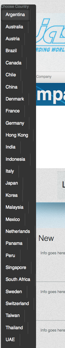
Then on hover or click:
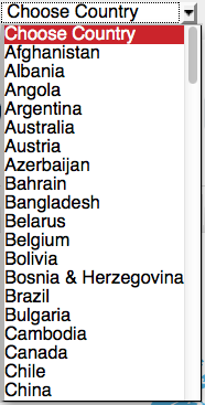
The first image shows what the default state should be (which I assume in CM1 is the title of the auto-page list widget since there is no actual section called “choose country”)
The second image is what is seen when you hover (or click if an HTML selector) over the “choose country” title.
So far, the various CSS scripts I’ve found assume a level above the country page links. On my site, that particular level has multiple sub-sections beyond the country section below which the country pages live. So in order for the site visitor to only see the list of countries, I have to point the auto-list to the country page template. The CSS assumes this is the first level of a flyout menu so it immediately shows every page that is tied to the country template rather than only displaying when hovering over “choose country”.
So it looks like this if the auto-page list widget filters to the country page template:
So the question is, how do I display a single link (in this case “choose country”) over which when you hover, it drops down all the pages that use the country page template being called from the auto-list widget?
Would something like this support what you are trying to do? Again, it’s all CSS, but this makes it more like a drop down using the single level items like you will have.
.perc-list-main {
height: 25px;
position: relative;
}
.perc-list-main:before {
background-color: #ECECEC;
border: 1px ridge #999999;
color: #363636;
content: "Choose a Country";
cursor: pointer;
display: block;
font-weight: normal;
padding: 3px;
text-shadow: 1px 1px #FFFFFF;
}
.perc-list-main:hover:before {
background: none repeat scroll 0% 0% #DDDDDD;
text-decoration: underline;
}
.perc-list-main:hover li {
display: block;
}
.perc-list-main li {
background: none repeat scroll 0% 0% #8C8C8C;
border-left: 2px solid #71C867;
border-right: 2px solid #71C867;
display: none;
list-style: none outside none;
margin: 0pt;
padding: 2px;
}
.perc-list-main li:first-child {
border-radius: 5px 5px 0pt 0pt;
border-top: 2px solid #71C867;
}
.perc-list-main li:last-child {
border-bottom: 2px solid #71C867;
border-radius: 0pt 0pt 5px 5px;
}
.perc-list-main li a {
color: #FFFFFF;
display: block;
font-family: Verdana;
font-weight: normal;
margin: 3px;
padding: 3px;
text-shadow: 1px 1px #333333;
}
.perc-list-main li a:hover {
background: none repeat scroll 0% 0% #797979;
border-radius: 3px 3px 3px 3px;
border: 1px inset #F9F9F9;
color: #71C867;
margin: 2px;
text-decoration: none;
} ```
The screenshot below is actually using a Page Auto-List to populate it and give the effect.
[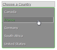](https://d37wxxhohlp07s.cloudfront.net/s3_images/838140/Auto-List%20DD.png?1357157700)The trick with this is two-fold:
- Use the “Content” property to create the before item
- A background image would have to create the arrow and all illusions to give the effect of a select box. Here I am just using a border and background color.
Oh, and this is also using CSS3 which will only support current browsers but those effects are primarily related to the border around the box. The border-radius and last-child are the only things lost without CSS3 support.
Thanks Daved, this is exactly what I needed. I think the :before and “content” were the missing links in the equation.
Thanks so much.
I updated the CSS to turn the wrapper into part of the drop down, and to make the UL a scrollable list. I think this looks a little better. Just make sure you prefix all classes with a root class or wrapper class to prevent this from affecting all auto-lists on a page.
height: 25px;
width: 200px;
}
.perc-list-main {
background: none repeat scroll 0% 0% #8C8C8C;
border-radius: 7px 7px 7px 7px;
border: 2px solid #71C867;
display: none;
margin: 0pt;
max-height: 125px;
overflow-x: hidden;
overflow-y: scroll;
padding: 0pt;
position: relative;
}
.perc-list-main-wrapper:before {
background-color: #ECECEC;
border: 1px ridge #999999;
color: #363636;
content: "Choose a Country";
cursor: pointer;
display: block;
font-weight: normal;
padding: 3px;
text-shadow: 1px 1px #FFFFFF;
}
.perc-list-main-wrapper:hover:before {
background: none repeat scroll 0% 0% #DDDDDD;
text-decoration: underline;
}
.perc-list-main-wrapper:hover li, .perc-list-main-wrapper:hover ul {
display: block;
}
.perc-list-main li {
display: block;
list-style: none outside none;
margin: 0pt;
padding: 2px;
}
.perc-list-main li a {
color: #FFFFFF;
display: block;
font-family: Verdana;
font-weight: normal;
margin: 3px;
padding: 3px;
text-shadow: 1px 1px #333333;
}
.perc-list-main li a:hover {
background: none repeat scroll 0% 0% #797979;
border-radius: 3px 3px 3px 3px;
border: 1px inset #F9F9F9;
color: #71C867;
margin: 2px;
text-decoration: none;
} ```
[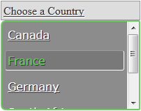](https://d37wxxhohlp07s.cloudfront.net/s3_images/843422/ScrollableAuto-List.png?1358203819)