Would it be possible to improve the displayed widget title when widget is empty?
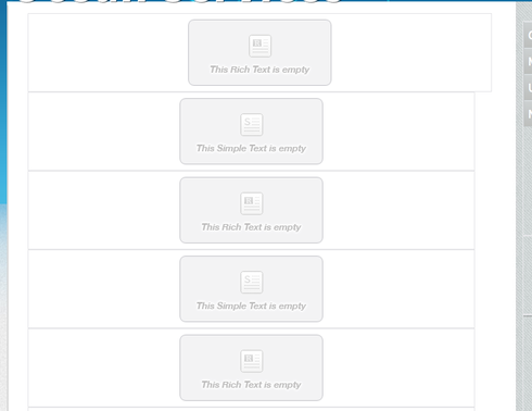
Currently, when a widget is empty and available for a contributor to add content, they see this:
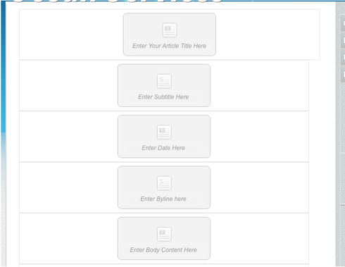
Ideally, what a contributor sees when they go to edit a page would be more descriptive widget information such as this:
This would make it MUCH easier for site administrators to manage content and avoid the problem of contributors putting content in the wrong widgets.
Additionally, it would be great if only those regions in which a contributor has authority to edit would be highlighted in something like orange or red.
Finally, the tool tip (that CAN be set in the properties of the widget) should show the category of widget. In other words, switch around what is displayed so that the tool tip says “this Rich Text is empty” and the displayed title of the widget is a user setting as seen in the above image.

